
On Journey Affiliate Platform Redesign
On Journey Affiliate Platform Redesign
Enhance end-to-end flow and usability of a travel agent affiliate link platform
Project Type
Interaction
Role
UI/UX Designer
Year
2025
At a Glance
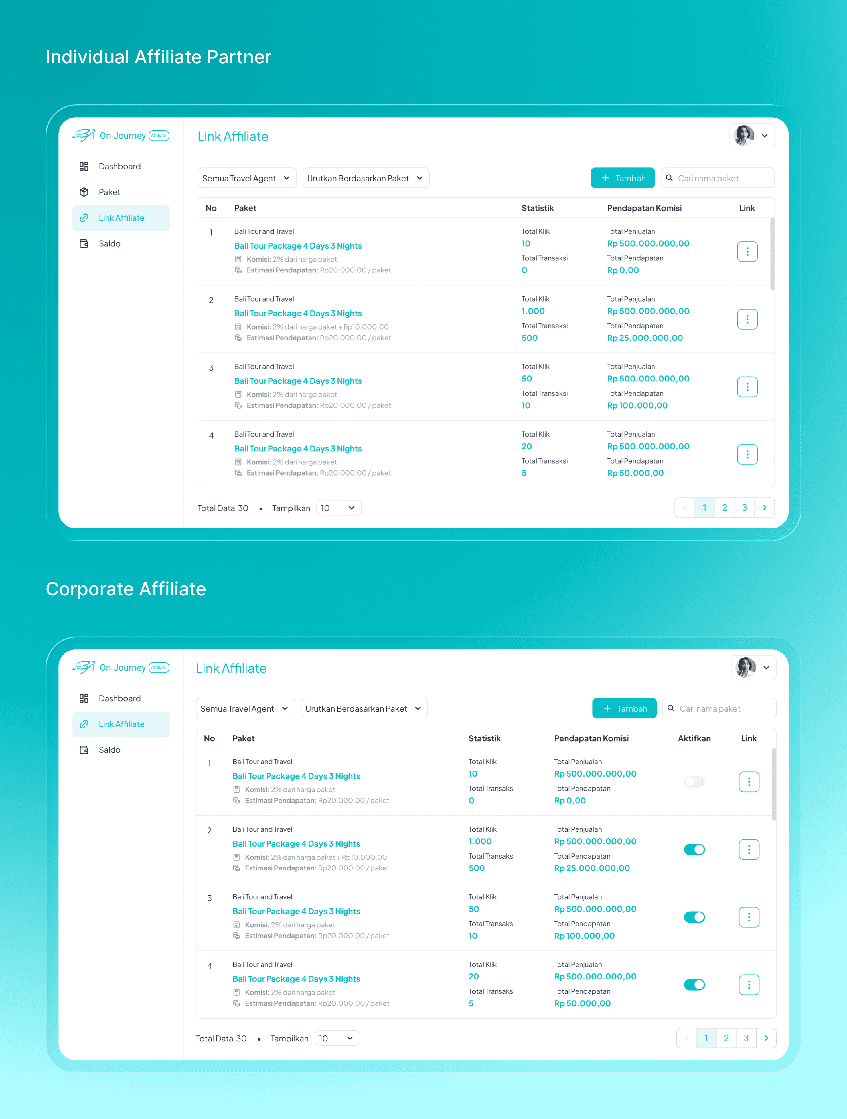
On Journey Affiliate is a travel affiliate platform that empowers partners—ranging from corporate hotels (B2B) to individual influencers (B2C)—to monetize travel package posted in the main On Journey application through commission-based links.
This was a comprehensive end-to-end redesign of a legacy, engineering-led MVP. The initiative moved the product from a complex database interface to a user-centric dashboard. The primary focus was unifying the experience for dual personas (Corporate & Individual) into a single, scalable architecture that reduced operational friction.
The Problem
The Friction
The platform was originally built as a "database-first" MVP. While functional, the architecture mirrored the backend schema rather than the user’s mental model. This created a high-friction environment where generating revenue-driving links was unintuitive and prone to error.
The Business Gap
The complexity created a barrier to entry. For Corporate partners (Hotels), the manual effort required to manage inventory slowed down operational integration. For Individual partners, the learning curve threatened engagement. The design debt was effectively capping the potential volume of affiliate sales.
The Process: Strategy & Audit
The Heuristic Audit: Diagnosing Usability Debt
I conducted an evaluation of the legacy interface to identify why users struggled to convert. The audit revealed that the MVP was actively discouraging interaction.
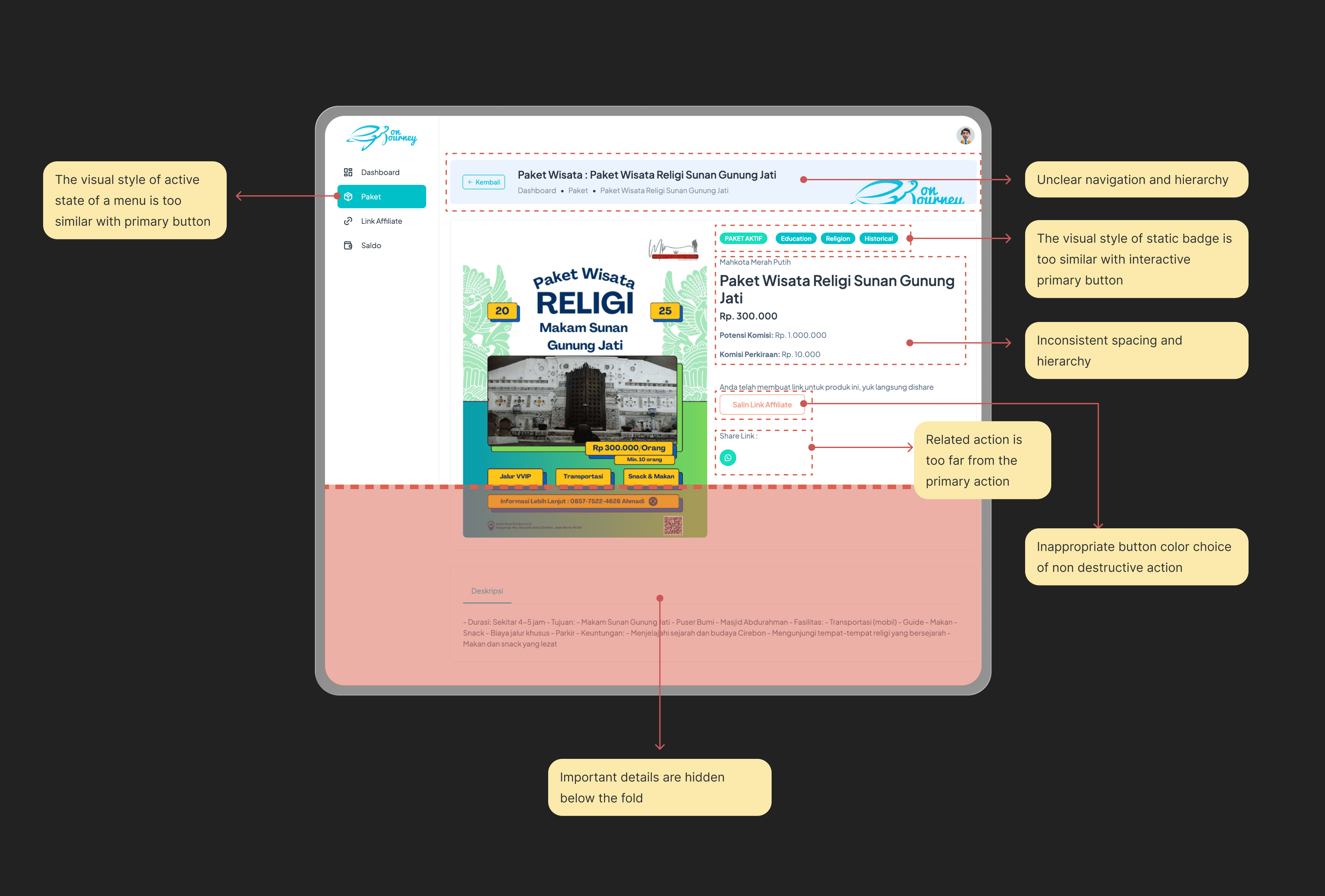
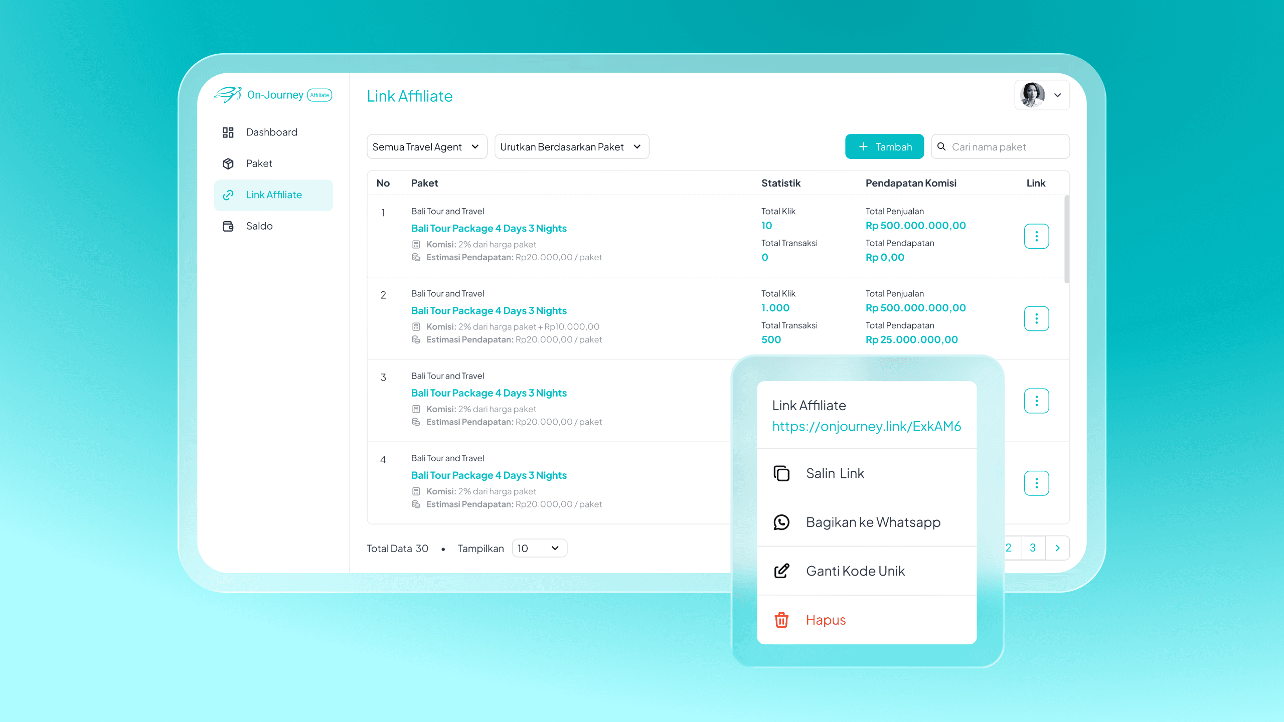
Example #1 - Heuristics audit for travel package detail
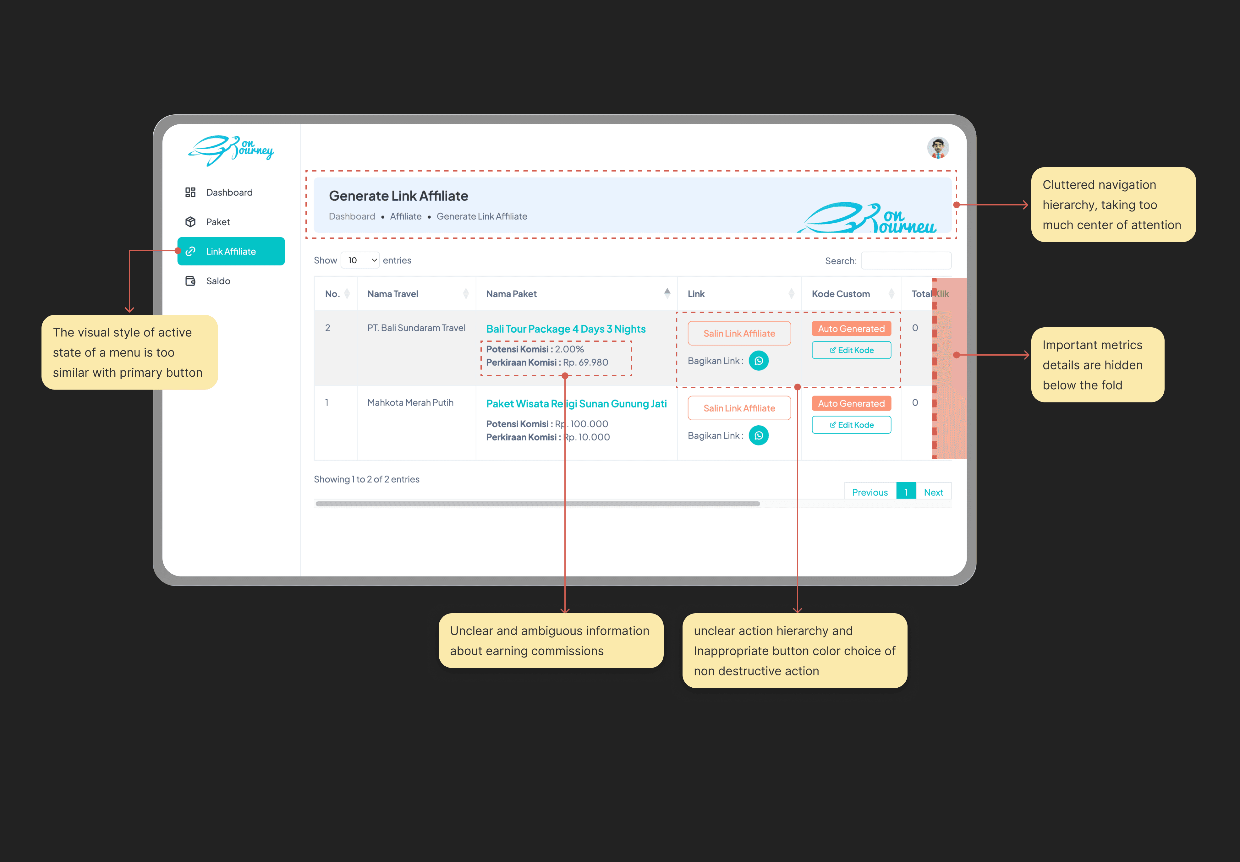
Example #2 - Heuristics audit for list of active affiliate link
Key Usability Issues
Destructive Semantics for Positive Actions: The primary revenue driver—"Copy Affiliate Link"—was styled in red. This subconsciously signaled danger or error to the user rather than success.
False Affordances: Static status badges and non interactive elements shared the exact visual treatment as interactive primary buttons. This forced users to "guess" which elements were clickable.
Violations of Proximity: Related actions were spatially disconnected. The "Share to WhatsApp" button was isolated from the "Copy Link" button, breaking the natural workflow of the affiliate partners.
Buried Value: Critical financial data needed to pitch the product was consistently hidden below the fold.
The Solution
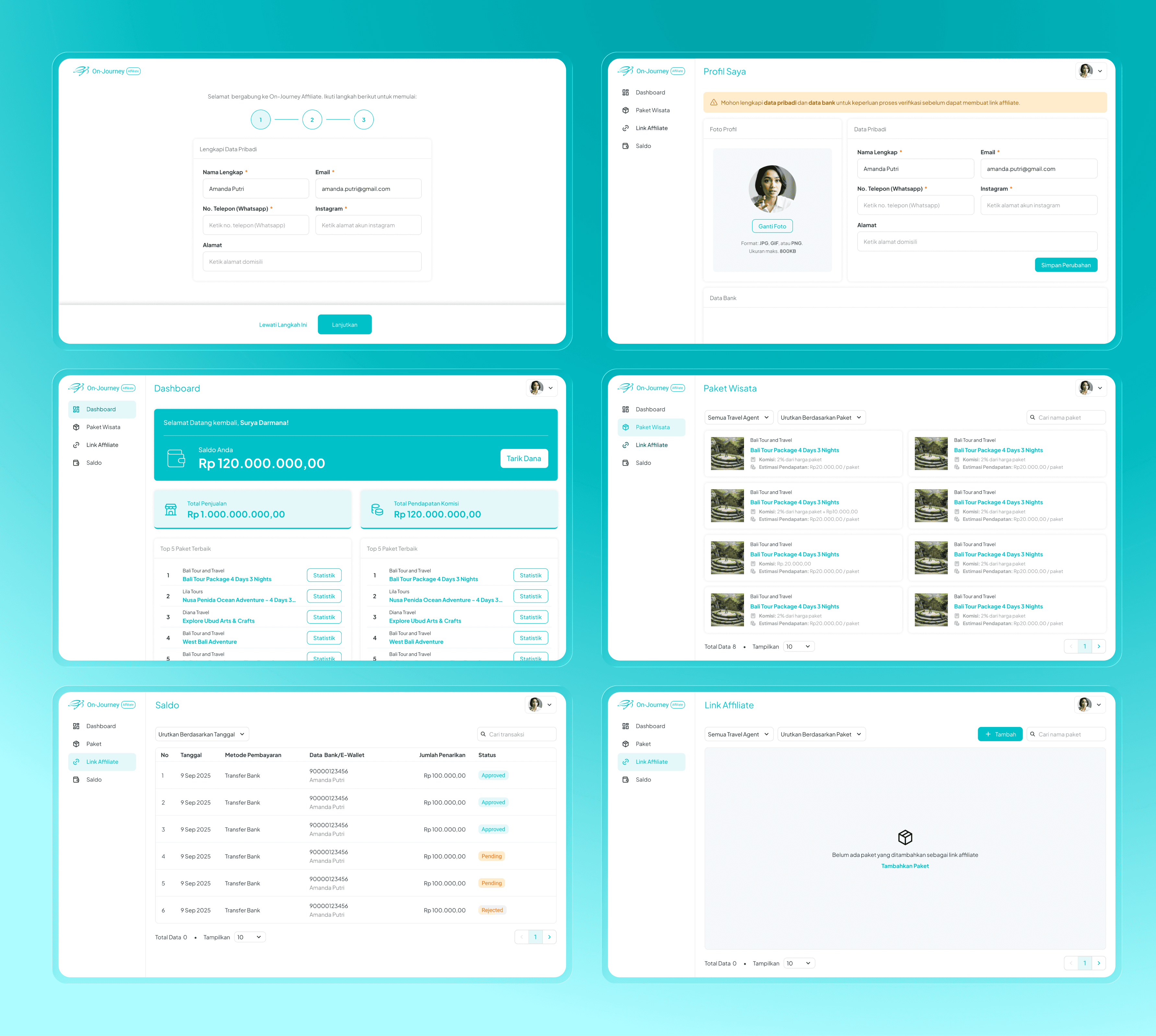
1. The "Sales-Ready" Dashboard
I redesigned the main table view to reduce cognitive load and prioritize actionable data.
Clearer Data Scanning: I stripped away visual noise, allowing the user to focus on the metrics that matter: Total Clicks and Total Sales.
Corrected Semantics: The "Add" (Tambah) button is now a clear primary action in Teal, establishing a positive pattern for creation that contrasts sharply with the previous red outlines.
Contextual Actions: I introduced a "kebab" menu for secondary actions, decluttering the interface while keeping advanced management tools accessible.
2. The Conversion-Focused Detail Page
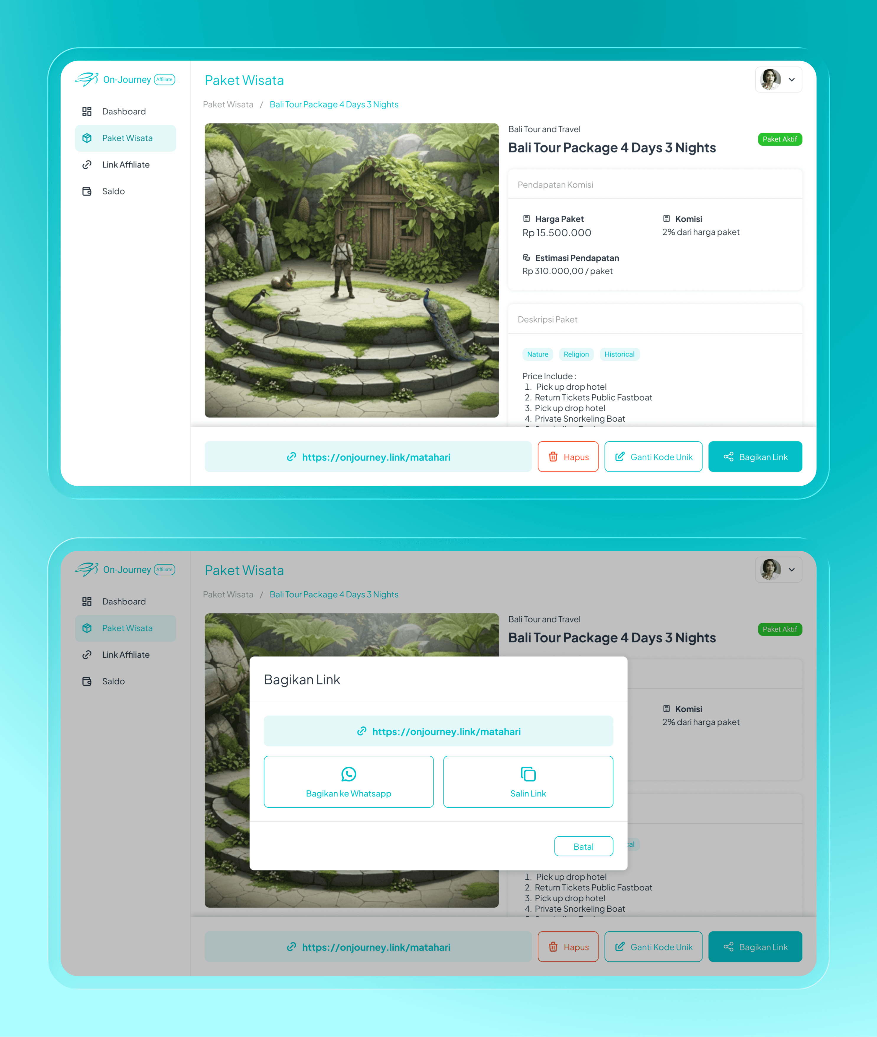
The detail page was restructured to function as a "Sales Kit" for the affiliate partner.
Elevating the Value Proposition: I moved the financial data above the fold. The "Commission" and "Package Price" are now presented in a high-contrast card, instantly answering the user's primary question: "Is this worth selling?".
The Unified Action Bar: I addressed the proximity issues by grouping the unique URL, "Share Link" button, and "Change Code" options in a single horizontal container. This matches the user's mental model: Get link -> Customize -> Share.
Solving False Affordances: I redesigned metadata tags to look like information, not buttons, preventing navigation errors.
System-Wide Optimization
While the link generation flow was the primary revenue driver, I conducted a complete audit of the supporting ecosystem to ensure consistency.
Accelerating Time-to-Value (Onboarding): I simplified the registration logic, deferring non-essential data collection until after the user had experienced value.
Data Integrity & Profile Management: The legacy profile settings were unstructured. I regrouped fields into logical clusters (Personal vs. Financial) and added real-time validation to prevent future payout failures.
Heuristic Visibility (Empty States): I addressed the "blank page" problem by designing illustrative empty states that function as "mini-onboarding," guiding users on exactly what action to take to populate the screen.
Signal-to-Noise Ratio: I optimized the dashboard for speed. By removing decorative assets and pushing critical KPIs above the fold, I ensured users could get a "health check" of their business in under 5 seconds.
The Results
Operational Efficiency
We achieved an estimated 60% reduction in 'Time-to-Listing' for Corporate partners by replacing the manual selection flow with a bulk-toggle system.
Development Velocity
By utilizing a unified architecture for both user personas, we cut the frontend delivery scope by ~40%, allowing the engineering team to focus on stability rather than duplicate feature work.
Usability Compliance
The audit remediation (fixing inconsistencies and false affordances) eliminated the top 3 friction points identified in user testing, creating a frictionless path to revenue generation.