On Journey
On Journey
Empowering conventional travel agents and allowing travelers to customize their trip
Project Type
Interaction and Visual
Role
Lead UI/UX Designer
Year
2024 - Ongoing

At a Glance
On Journey is a travel ecosystem designed to democratize the Indonesian tourism industry. While giants like Traveloka and Agoda dominate the mass market, they often leave out local, conventional travel agents who offer the most authentic experiences. While the Product Manager handled market validation, I was brought in to translate complex business requirements into a polished, investable digital product.
As the Lead UI/UX Designer, I owned the Visual Language, Design System, and Interaction Design of a dual-sided platform: a SaaS dashboard empowering local agents to digitize their inventory, and a customer-facing marketplace where travelers can discover and customize curated, authentic trips. The project has successfully secured seed funding and placed 3rd in the NextDev Startup Incubator competition.
The Problem
How might we build a digital bridge that empowers non-tech-savvy agents to sell online while giving travelers the freedom to personalize their journey?
The Business Challenge
The platform serves two very different user groups: non-tech-savvy local agents (B2B) and modern, aesthetic-conscious travelers (B2C).
The Design Challenge (Visual & Interaction)
Complexity vs. Clarity: Customizing a travel itinerary involves massive amounts of data (dates, pricing, add-ons). The initial concept was overwhelming.
Trust Gap: New platforms often look "scammy." We needed a world-class visual identity to establish immediate trust with users who are spending millions on a trip.
Scalability: We needed a consistent UI framework that could work across both a complex Admin Dashboard and a consumer Mobile App.
The Process
My approach focused on Atomic Design and High-Fidelity Prototyping to bridge the gap between abstract requirements and developer implementation.

Foundation & Design System
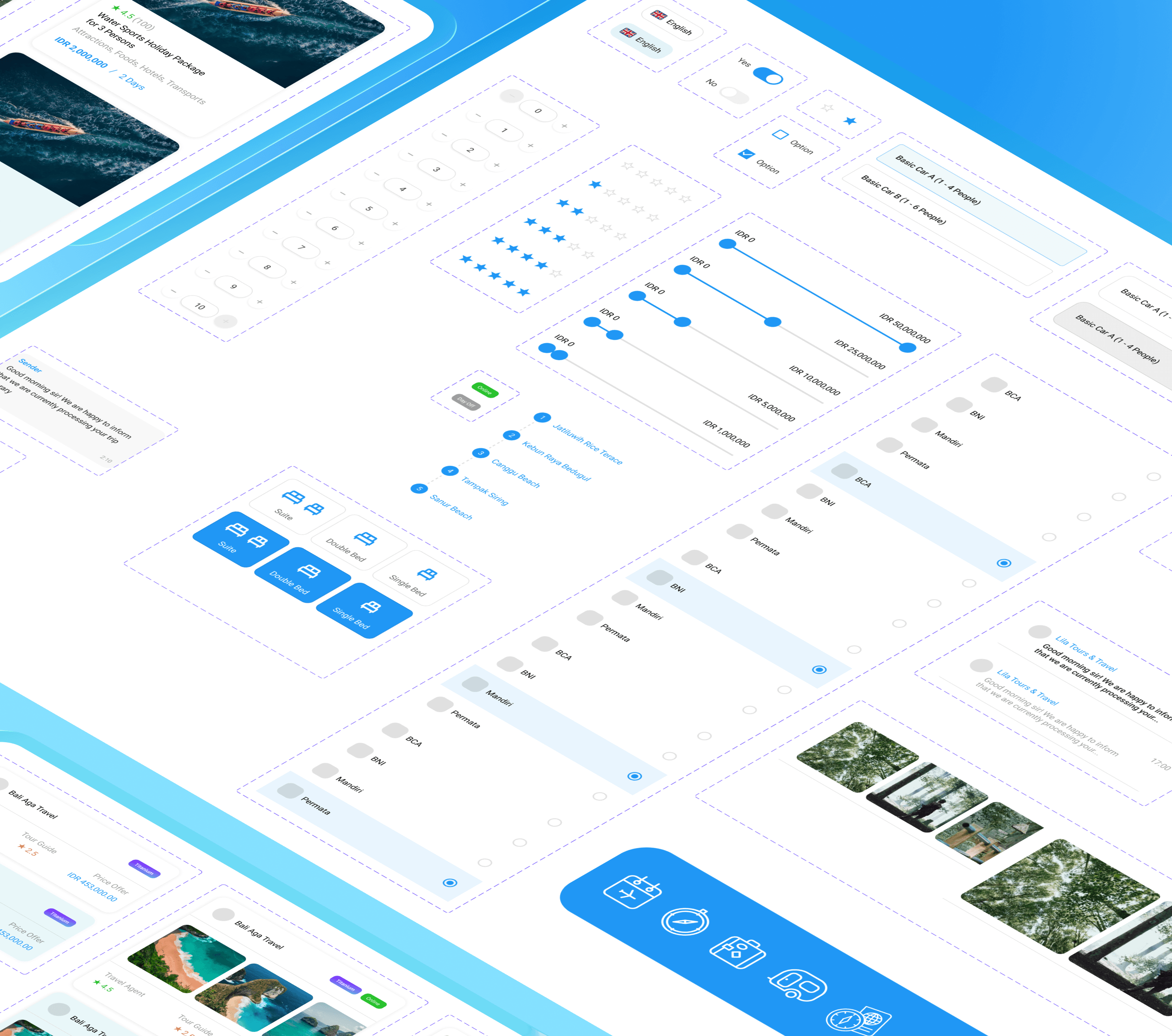
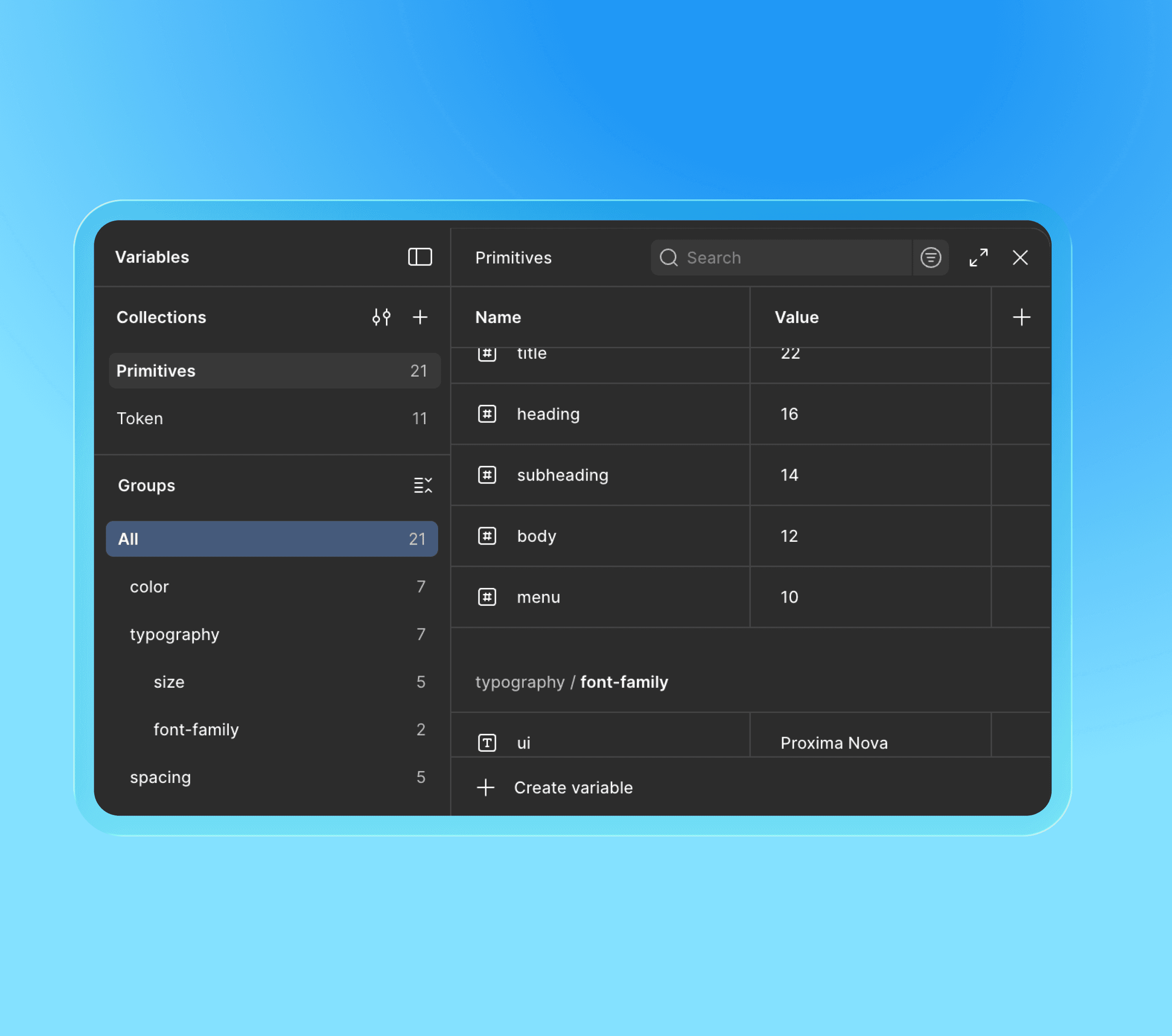
Established a robust Component Library early on. I defined the typography, color psychology (using calming, trust-inducing tones suitable for travel), and reusable components (cards, booking inputs) to ensure speed and consistency.
Standardized the "Booking Widget" logic so it could be reused across different travel packages.
Visualizing Complexity (UI Architecture)
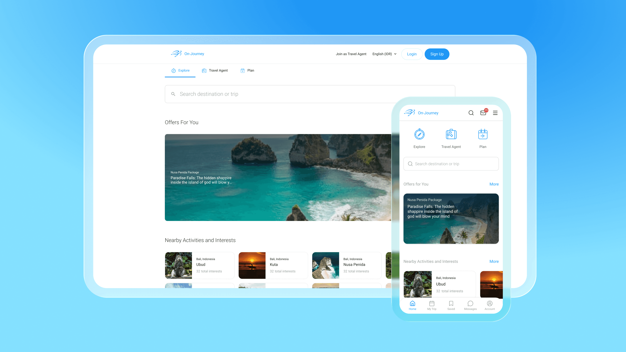
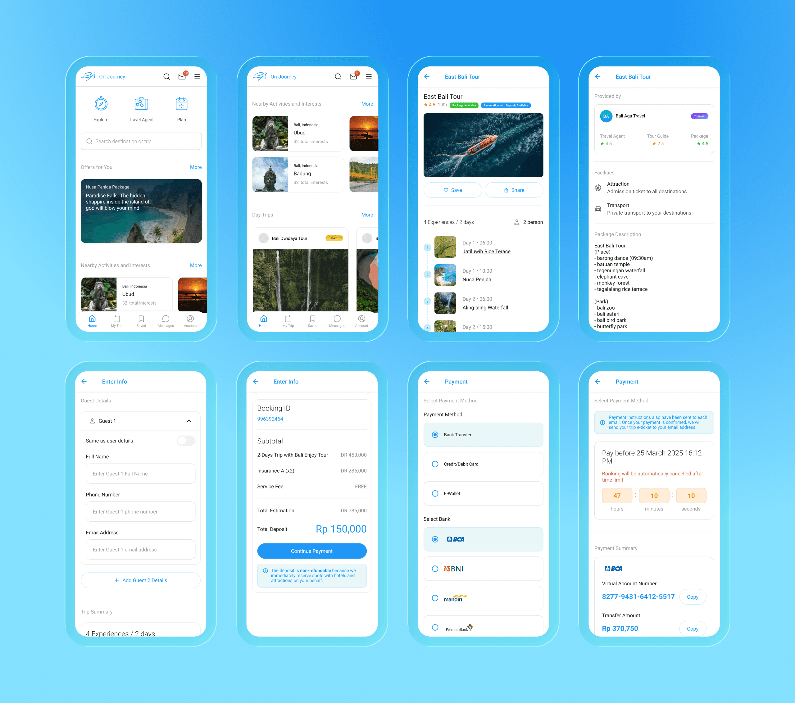
I translated the PM's requirements into high-fidelity screens. I focused heavily on Information Hierarchy—ensuring the "Price" and "Book" buttons were prominent, while secondary details (terms and conditions) were accessible but not intrusive.
Interaction Design
Created interactive prototypes to demonstrate the "Custom Trip" flow. This was critical for the developers to understand the logic of adding/removing itinerary items without needing 50 pages of documentation.
Designed "Empty States" and "Loading States" to ensure the app felt responsive and polished even when data was fetching.
The Solution

I delivered a cohesive visual ecosystem that balanced utility with inspiration.
The Clean UI Language
Adopted a clean, minimalist aesthetic with heavy use of high-quality imagery to inspire wanderlust. I used whitespace generously to prevent the "cognitive load" usually associated with booking engines.
Smart Interaction Flows
For Agents: Designed a "Wizard" style form for uploading packages. Instead of one long page, I broke it down into small, digestible steps with progress bars to reduce drop-off rates.
For Travelers: Designed a drag-and-drop interface (or easy toggle system) for itinerary customization, making the complex task of trip planning feel like a game.
Developer Hand-off
Provided a pixel-perfect design system including spacing tokens, font styles, and asset exports, reducing the need for back-and-forth questions during the coding phase.

The Impact
The high-fidelity prototype was the primary tool used in the pitch deck, directly contributing to securing Pre-Seed Investment and the NextDev 3rd Place win. Investors specifically noted the "professional look and feel" of the MVP.
The polished UI helped the business team convince Hotel Chains and Affiliates that On Journey was a legitimate, premium player, not just another small project.
By utilizing a strict Design System, I helped the development team reduce frontend UI errors, accelerating the MVP launch timeline.
Key Takeaways
Visuals Create Value: In early-stage startups, "Design" is often the only tangible thing investors can see. High-quality UI/UX turns a "concept" into a "product."
System Thinking Saves Time: Building a design system upfront might feel slow, but it allowed us to build the Agent Dashboard and Traveler App simultaneously without losing visual consistency.
