
Kembang
Kembang
Detail Coming Soon Empower Indonesian millennials and gen-z soon-to-be mothers through mobile companion
Project Type
Interaction, Visual Identity
Role
Product Designer
Year
2024
At a Glance
I led the end-to-end product definition for "Kembang," a conceptual digital solution for a client in the early ideation phase. Acting as the sole product designer, I translated a raw business hypothesis into a fully realized MVP, delivering the brand identity, user experience strategy, and a scalable design system ready for engineering handoff.
The Problem
The client was in the ideation phase with a market theory but no product definition. They identified that first-time Indonesian mothers feel anxious and uncertain due to a lack of continuous support from local clinics.
However, simply copying existing global apps was not a viable strategy. Research revealed that users were abandoning competitor apps due to specific friction points:
Critical medical info was often in English or used complex jargon that alienated users.
Unmoderated forums fostered "comparison culture" and judgment, leading to negative emotional experiences.
The Goal
Define a product that bridges this gap by prioritizing psychological safety and local cultural nuance.
The Process
I utilized secondary research and competitive benchmarking to define the product strategy. The data showed that millennial mothers are motivated by a desire to reduce anxiety and feel "accompanied" rather than just informed.
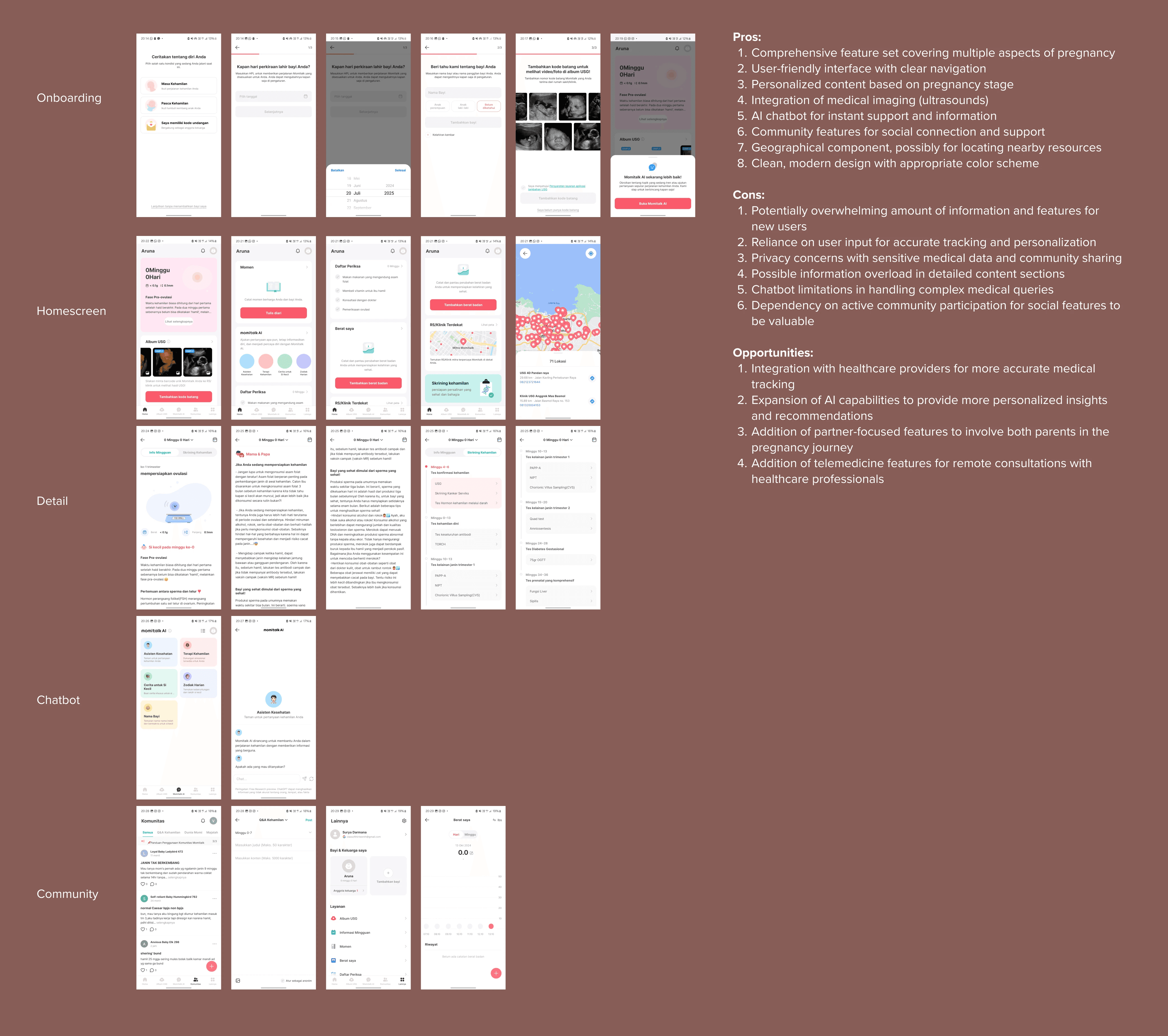
1 of 3 competitors analysis example
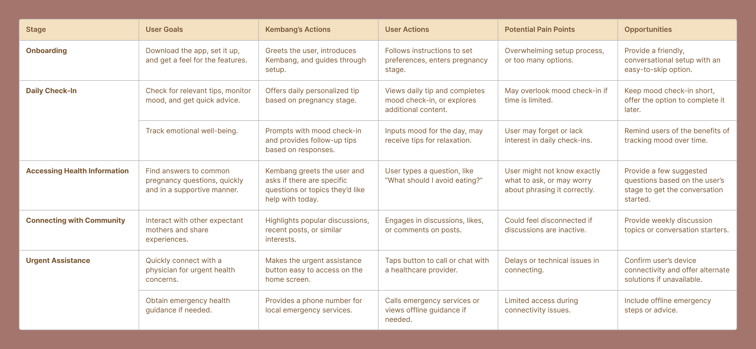
User journey map
My design strategy focused on three pillars:
Hyper-Localization: Moving beyond translation to "transcreation," ensuring content uses accessible, vernacular Bahasa Indonesia rather than strict medical terminology.
Psychological Safety: Designing community features with strict moderation policies to prevent judgment.
Personalization: Shifting from generic advice to tailored content based on pregnancy stage to prevent information overload
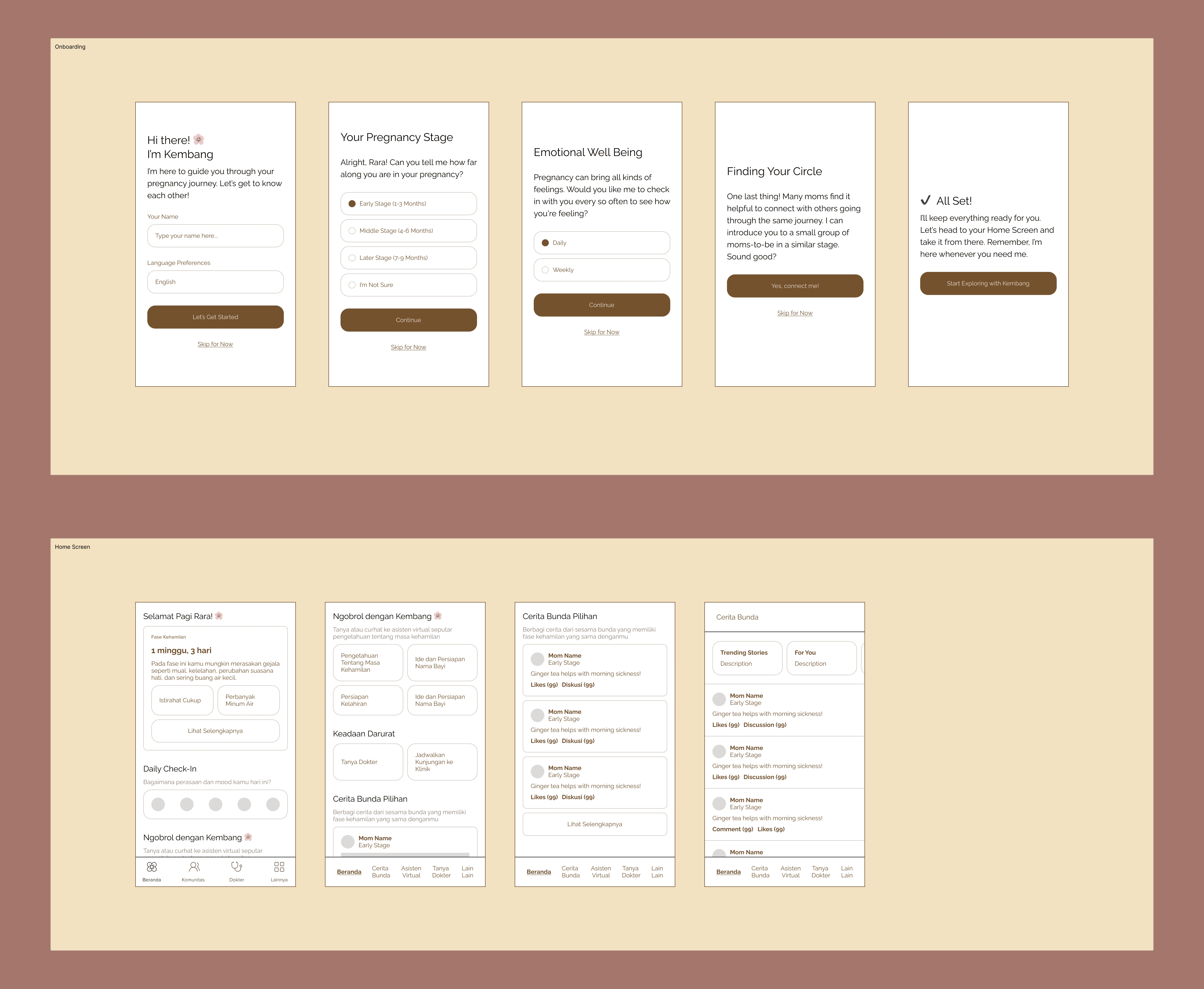
Early wireframe concept
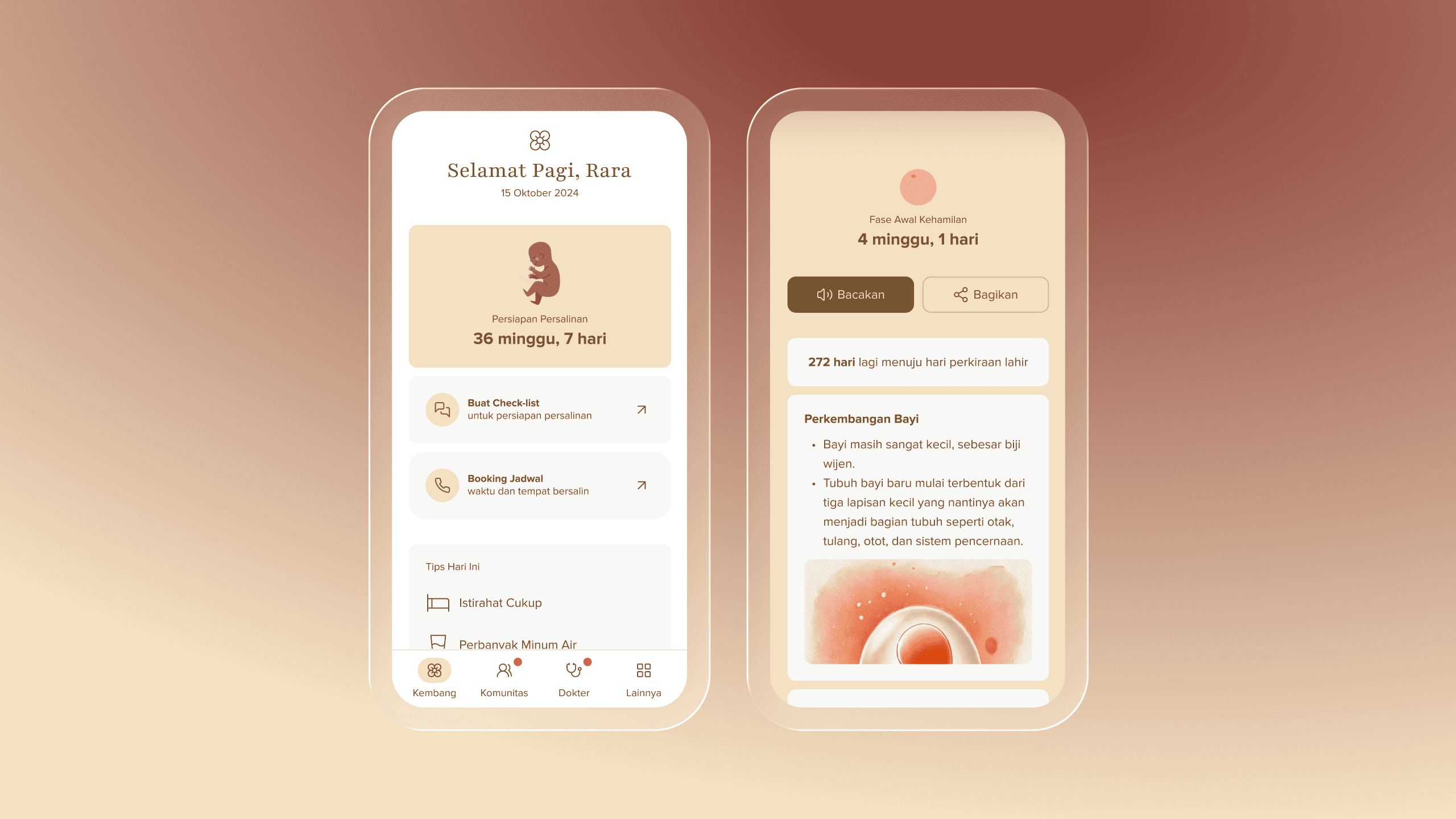
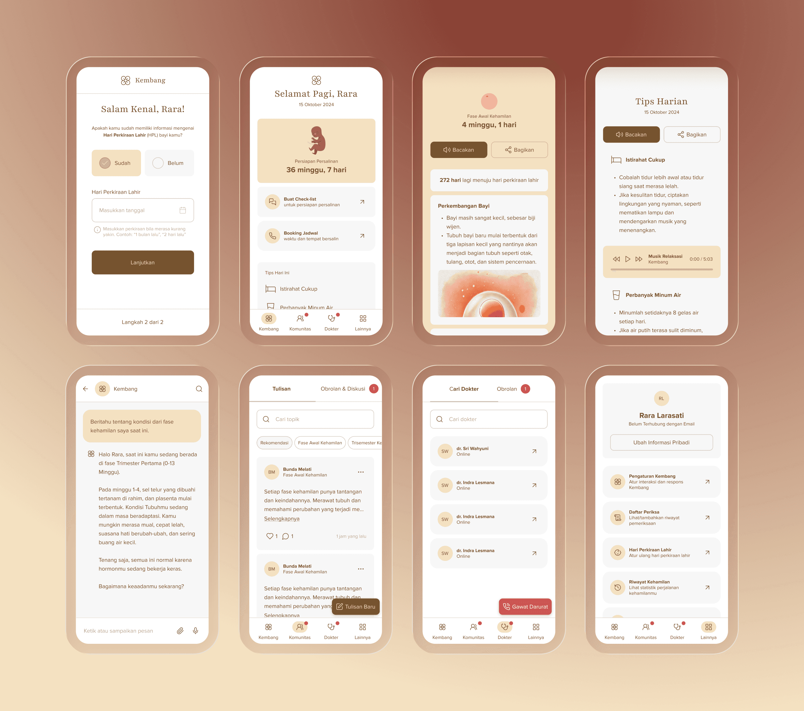
The Solution: Meet Kembang
I developed "Kembang"—a digital personal assistant that utilizes AI technology backed by human moderation.
The "Personal Assistant" Model
Instead of a static information repository, the UI mimics a conversation with a trusted companion.
Tanya Jawab (Q&A): A direct line to knowledge, framed as a conversation.
Curhat Santai (Casual Chat): A dedicated space for psychological and emotional release, separating feelings from medical facts.
Daily Guidance: A "Tips Hari Ini" (Tips of the Day) module pushes bite-sized advice (e.g., hydration, rest) to keep users on track without overwhelming them.
Brand & Identity: Visual Therapy
I owned the end-to-end branding. Drawing on the dual meaning of "Kembang" (flower) and "Berkembang" (to flourish/progress), I utilized a "Visual Therapy" approach. For the illustration assets, I used watercolor textures and a soft earth-tone palette to subconsciously reduce user anxiety and reinforce the theme of blooming.
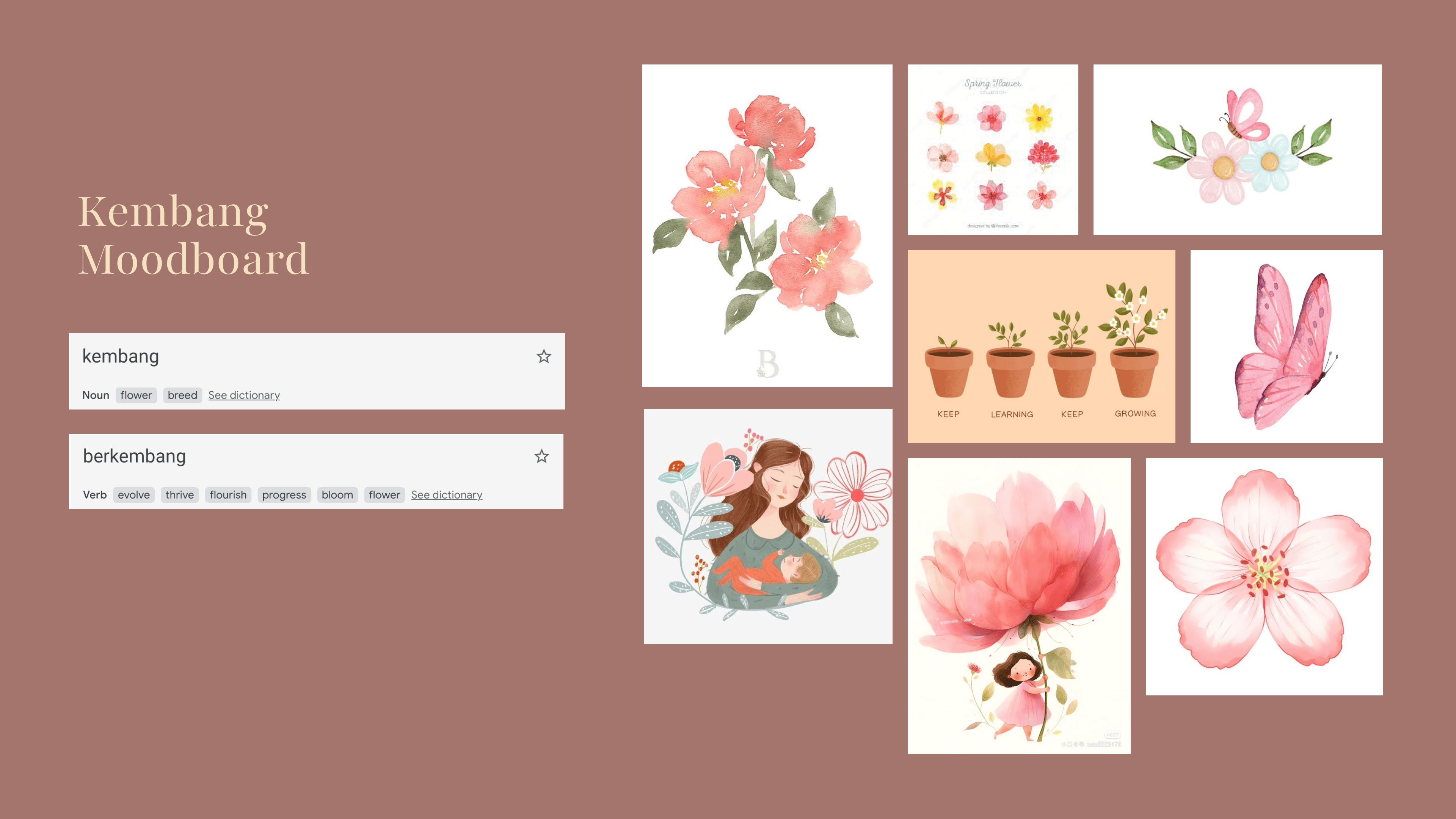
The moodboard for Kembang brand & identity
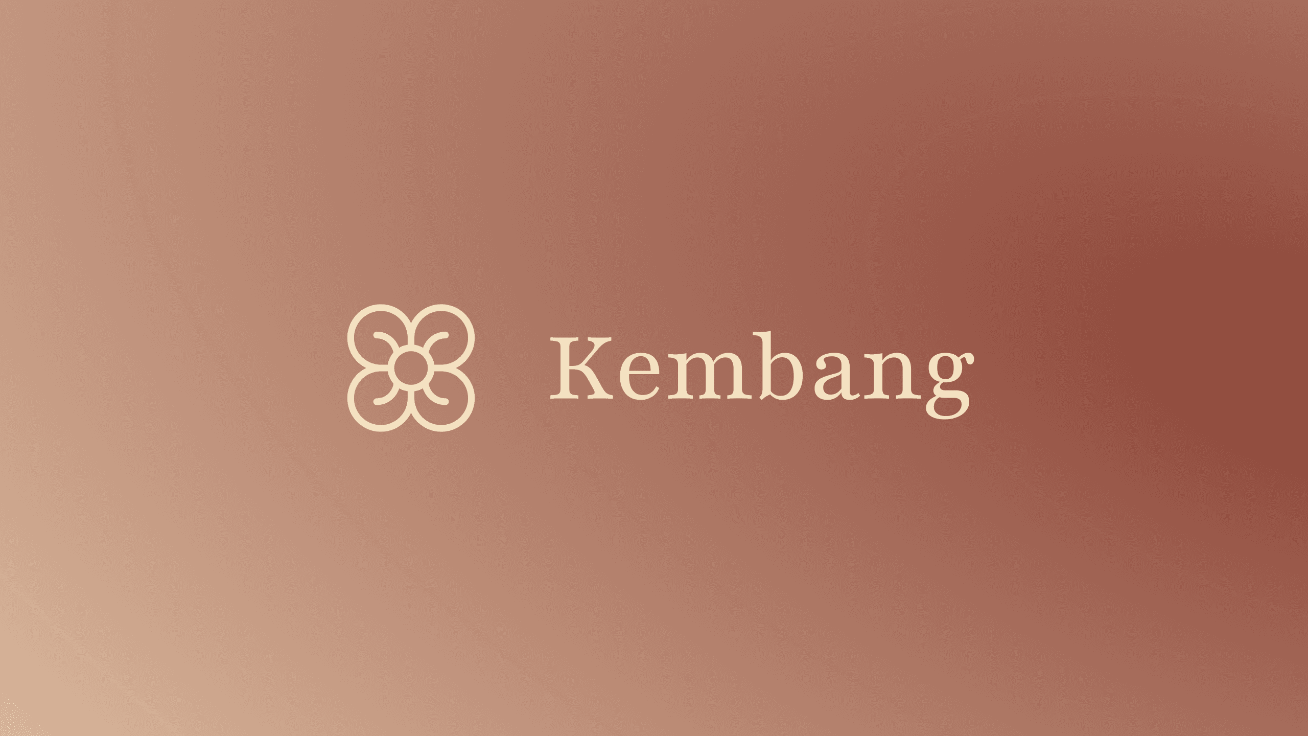
The logo for Kembang
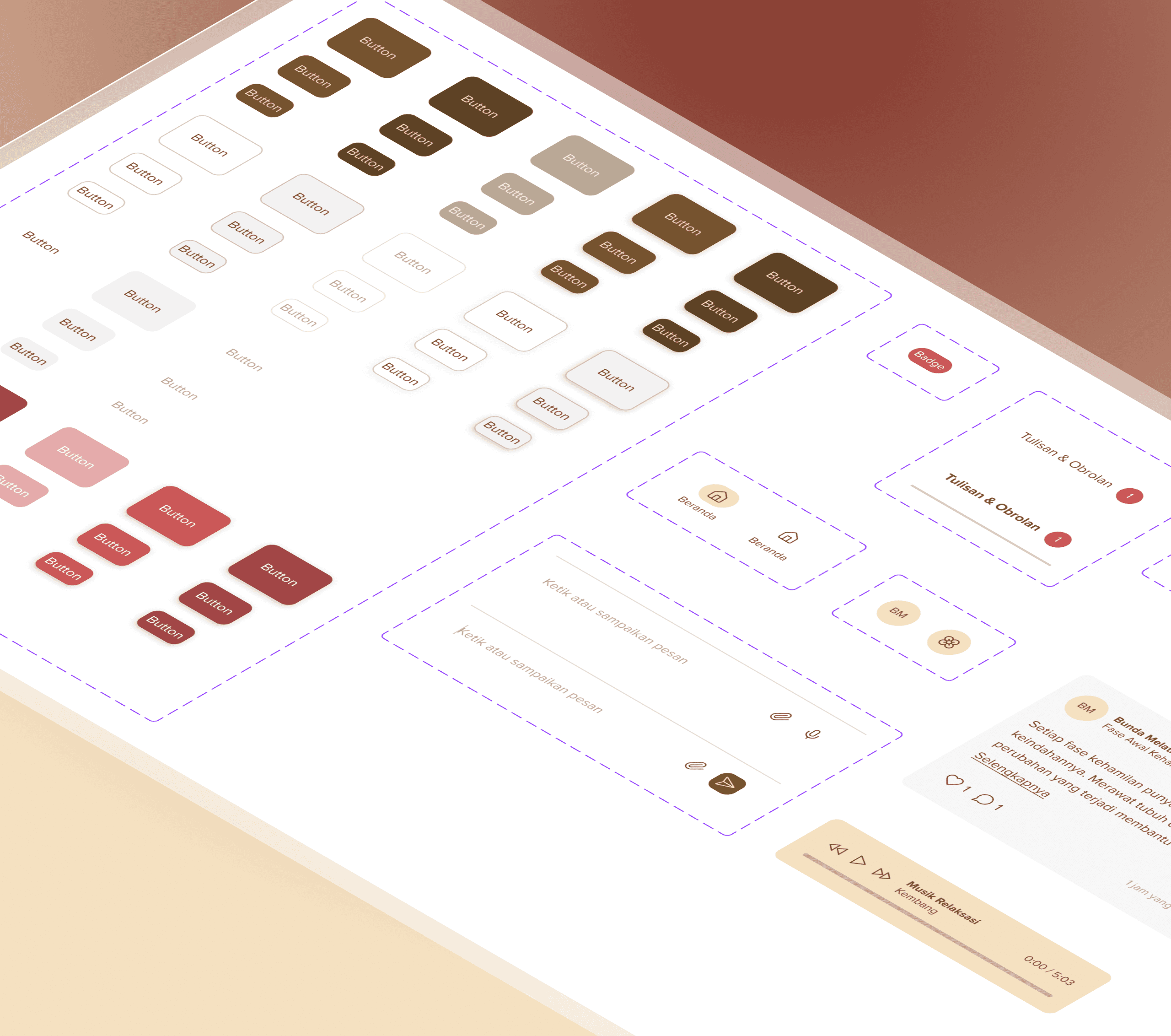
The Design System: Scalability from Day 1
To ensure the product could scale efficiently after handoff, I built a modular Design System:
Atomic Components: Standardized button states, input fields, and iconography to ensure consistency across features.
Specialized UI: Created custom components for the audio player and chat interfaces, ensuring interaction models were intuitive.
Accessibility: Typography hierarchies (Heading vs. Body) were strictly defined to improve readability on mobile devices.
The Result
The project concluded with the delivery of a production-ready design package, bridging the gap between concept and engineering.
To ensure the vision was executed pixel-perfectly without constant design oversight, I delivered a structured technical package to the engineering team:
Foundational Style Guide: Defining the "Visual Therapy" aesthetic, Hex/RGB codes, and typography hierarchies.
Atomic Component Library: Defining all necessary states (Default, Hover, Pressed, Disabled) to prevent guessing games during development.
Outcome: The client received a complete, developer-ready blueprint to build the MVP, successfully moving from a theoretical business idea to a concrete product roadmap.
Key Takeaways
Systems Over Screens: Building a UI kit upfront wasn't just about organization; it was about ensuring the "calm" brand attribute remained consistent across every interaction, even after I left the project.
Localization is UX: This project reinforced that translation is not enough. True accessibility requires adapting the tone and terminology to the user's cultural context.